One thing the Economist has started doing is explaining how they get their cover image lately. I have been reading the economist since college (1981!) and find this fascinating. I am sharing this one because I think the thought and work process is interesting.
Cover Story | How we chose this week’s image |
|
|
Our cover this week sets out to tell the parable of Hong Kong. In a new bill, the mainland government in Beijing has seized political control of the territory. At the same time, financial business is booming there, not least among Western banks. The same pattern of political oppression and commercial effervescence is to be found on the mainland. As China and America stage their first high-level diplomatic meeting under the Biden administration, this presents the free world with an epoch-defining question: how should it best secure prosperity, lower the risk of war and protect freedom as China rises?
The design problem we faced was how to strike a balance between the example of Hong Kong and the underlying story of the mainland. One promises to be a rich account of the fate of a territory of 7.5m people; the other, though more abstract, is about the great geopolitical question of the age. As you will see, we swung between the two approaches. |
|
|
One set of ideas focused on democracy. A yellow umbrella was an emblem of the protests that brought Hong Kong to a standstill in 2019. The pathos of a destroyed umbrella lying abandoned makes for a powerful image, but is better suited to a narrative about the past two years than to a package of articles about what happens next. The brolly is better when clasped by a protester, even if the focus is still narrowly on Hong Kong. |
|
|
Another set of ideas builds on the concept of a dominant China. In the map the mainland is literally eating the territory—as if it were a giant amoeba. But only a few weeks ago we had a cartographic cover featuring red China spreading across the territories of South-East Asia. The morphing flag is fresher, but the symbolism is wrong. The orchid tree on the Hong Kong flag is already an emblem of mainland rule, adopted at the handover from Britain in 1997. No morphing is required. |
|
|
Here is the hand in another guise, pressing down on a gaggle of protesters. Order is being restored. And next to it the print of the panda’s paw, having performed much the same manoeuvre. The print suggests that China is on the march, which usefully raises one of the questions we are trying to get at: where next?
It was becoming clear that the images alone would not strike the balance between the parable and the underlying story. The words would have to do the work. That thought led us to a shortlist of these three covers. |
|
|
The image says Hong Kong, the words China. That strikes the right balance. But we felt that this drawing was all about protesters and democracy, which leaves aside the fact that business in Hong Kong is booming even as civil liberties vanish. It is the combination of these two things that our cover package seeks to bring out. |
|
|
This works brilliantly as a poster, which is often a good measure of a cover. By taking one step back from the yellow-brollied protesters you see Hong Kong as a whole rather than its struggle over political representation. The red subtitle ties China’s brutality into the red paw-print. The drawback is that this cover has no explicit reference to the business boom. |
|
|
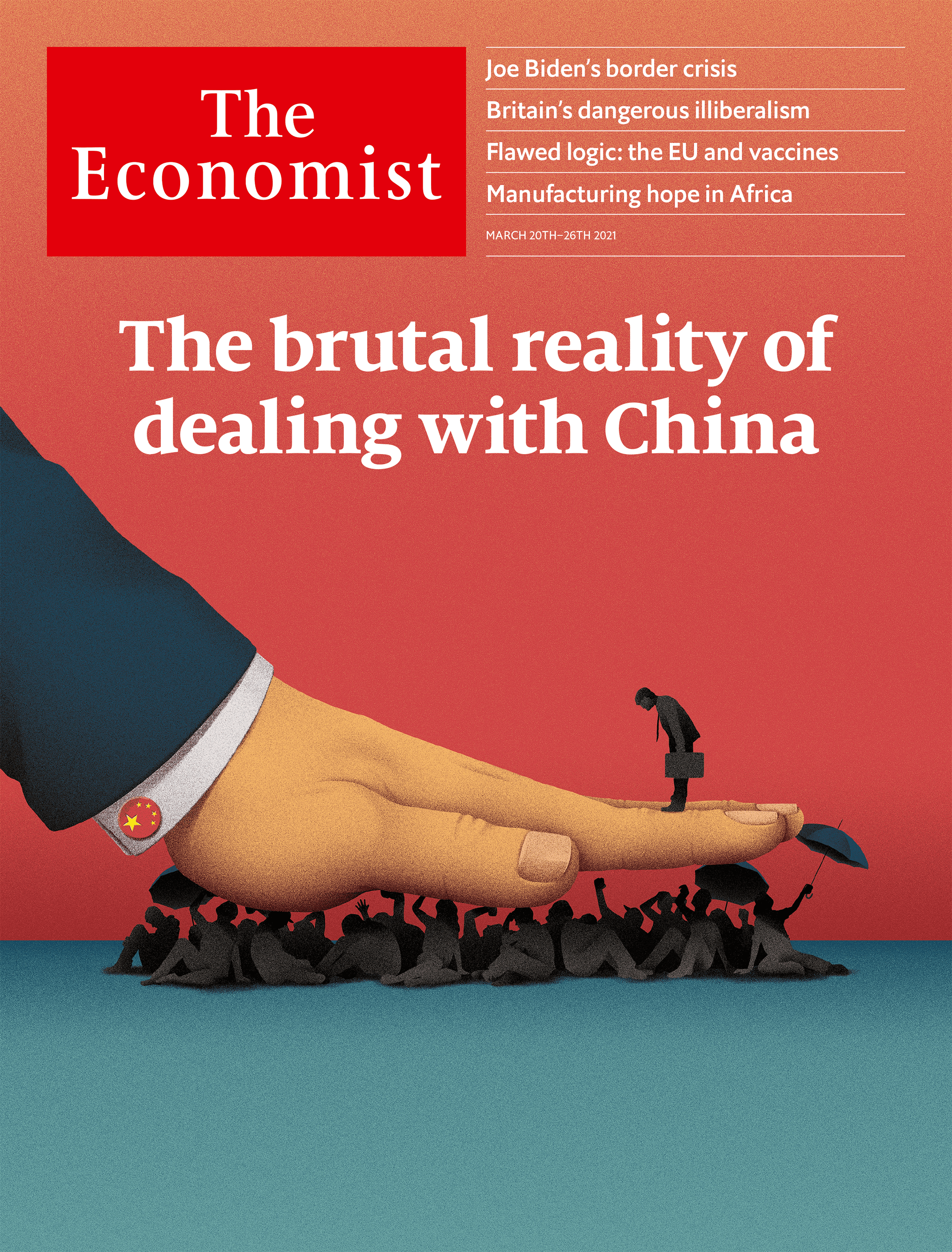
This is less eye-catching, but it is more successful at telling both sides of the story. The suppression of a crowd of would-be democrats creates the space for a trio of financiers eager to do deals. Because we thought some readers might miss that detail, we amplified it by putting a single briefcase-wielding man on the platform created by China’s oppressive hand.
We chose this design because the cover is not just about the power of China, but also about the fact that China has become a global centre of business, finance and innovation. That is the brutal reality. |
|
|


Very cool. I don't quite have a clear understanding of the politics, the thought process is fascinating and I like the cover the decided on the best.
ReplyDelete